LLM-first. Dual-sided consumer astrology. Built for the India no app designed for
Building India's first AI-native, dual-sided astrology platform from scratch for Tier 2 and 3 India, in multilingual, on low-end devices, with a human astrologer on one side and an LLM on the other.
56%
M1 Retention in users who saw insight of Past Life Module
5%
FTX drop-off on LLM modules
₹2L+/day
Revenue per day at 8 months


About MyNaksh
MyNaksh is India's first LLM-native astrology platform, not a marketplace of human astrologers like Astrotalk, but a DIY insight platform where users explore Kundli, Panchang, Dasha, horoscope, and more through AI-generated personalised content. Alongside it, a full partner app for professional astrologers to manage sessions, view user context, and run their practice. Both sides built from scratch.
My Role
Joined Day 0 as Design Head. No PM. So I owned product end to end.
Team
3 engineers at start
Grew to 3 designers under me
Timeline
MVP in 2 months
Scaled over 8 months
Before anything else
I do not personally follow astrology. My first 48 hours on the job were spent fixing that.
I wasn’t trying to become a believer. I was trying to understand believers. So I spent 48 hours deep in Jyotish texts, Kundlis, Dashas, Panchang flows, and real astrologer conversations. Because if you design through your own bias, you design the wrong product.


Let’s break down the problem
Zero data. Zero benchmarks. So I went to the market first.
This was a zero-to-one product. No prior version, no internal analytics, no user research to inherit. The founding brief was: build something great for astrology users on mobile. That was the entirety of the direction.
With no internal data, the only move was to understand the existing market before touching Figma. I went through every major player — Astrotalk, Astroyogi, Horocosmo, smaller regional apps. Spent time as a user on all of them.
The finding was consistent across every single app: they were all transactional. Nobody was experiential.
Industry Problem: Transactional App experience
Astrotalk was a marketplace, you book a human astrologer, pay per minute, get a reading. Astroyogi was the same with a slightly better interface. Smaller regional apps showed raw Kundli data with no interpretation. Every app treated the user as someone completing a transaction, not someone exploring their own life.
And none of them had designed for the user who actually drives the Indian astrology market: the 18-to-60-year-old in a Tier 2 or 3 city, on a budget Android phone, speaking Hindi, with a deep generational belief in astrology and zero expectation that any app would respect that belief.
That observation became the design thesis for MyNaksh. We were not going to build another transaction platform. We were going to build the first experiential astrology product in India.

Other Astrology Apps: feels transactional not experiential
Two separate products. One vision.
From day one, we knew MyNaksh needed to be dual-sided. The consumer app for the user who wants to explore their own astrology. The partner app for the professional astrologer who powers the human session layer. Both had to be built. Both had to work without the other being broken.
Consumer : the seeker
18 to 65 years old, Tier 2 and 3 India. Wants to read Kundli, Dasha, Panchang, horoscope through AI. Speaks Hindi or a regional language. Budget Android phone. Deep cultural belief in astrology. Has never had a product built for them.
Astrologer : the guide
Trained on Astrotalk. Any tool requiring new training gets abandoned. Needs familiar UX with AI capabilities layered on top. Earns per minute of session time, efficiency and earnings transparency are core needs, not nice-to-haves.
The per-minute problem
Every astrology platform charges users per minute for human sessions. This creates a specific trust problem: when an astrologer goes quiet to check the user's Kundli, the user cannot see that. On Astrotalk and every competitor, the chat just goes silent. Users assume the astrologer is idle. They feel cheated. They drop-off & don't come back.
This was not an astrology-specific problem. It was a service marketplace problem. And it had a design solution, we just had to build it.
LLM Latency Constraint
Every piece of content in MyNaksh is generated fresh by the LLM. That means every module has a real first-load wait. In a spiritual app, a spinner is not a neutral state, it is a trust-destroyer. Eight seconds of blank screen on a first experience and the user is gone. This was the biggest first-experience risk in the product.
Low End Device Constriant
Our users weren’t on flagship phones. They were on budget Android devices with limited RAM and weaker chips. So experiential design meant lightweight animations, progressive loading, optimized fonts, and graceful fallbacks. Performance was part of the UX.
Process
The thesis came first. The visual language followed.
Once we decided experiential over transactional, every subsequent design decision had a test: does this feel like something you explore, or something you complete? That question governed the visual language, the interaction model, the content architecture, and both sides of the product.
Visual identity: three directions, one that worked
Three directions tested before a first screen was designed. Looked premium in Figma. Tier 2 users in testing called it foreign and cold.
"Feels like a oversell of space" was the exact phrase from one session. Discarded.
Minimal wellness white backgrounds, pastel accents. Looked like a meditation app. Users said it did not take astrology seriously. Lost all cultural weight. Discarded
Warm Vedic modernism: beige parchment background, gerua dark maroon CTAs, gold accents, 3D planets, ornamental Vedic breakers. Users said it felt made for them. That was the only signal we needed.
Beige
Warm, unhurried. Not white, not cream. Aged paper energy that gives old vedic book vibes.
Gerua / dark maroon
Color of tilak, sindoor, sacred things. Instantly communicates cultural belonging without trying.
Cosmic Blue
Color of space, mystic, astrology, something that represents space and planetary alignments
The same visual language extended into the astrologer partner app. Same parchment base, same maroon CTAs, so the product felt like one coherent platform regardless of which side you were on.
How AI tools changed how we worked
AI helped us to achieve ~32% faster stakeholder alignment. Working prototypes within hours of concept agreement, not days. Critical when building two products simultaneously with a two-engineer team.

Figma Make
Rapid variant generation. 4–5 visual directions explored in time it previously took to build one.

ChatGPT
Hindi microcopy variants, interaction documentation, design system annotation across both apps.

Claude Code
Interactive mocks of complex flow, LLM loader, edge case for dev alignment pre development.
MVP
Consumer Side: 4 modules & why those
Once we decided experiential over transactional, every subsequent design decision had a test: does this feel like something you explore, or something you complete? That question governed the visual language, the interaction model, the content architecture, and both sides of the product.

Daily Horoscope
Every user knows what a horoscope is. This was the zero-friction entry, the module that required no explanation, no prior knowledge, no commitment. It gave users a reason to open the app daily while we earned the trust to take them deeper.

Panchang

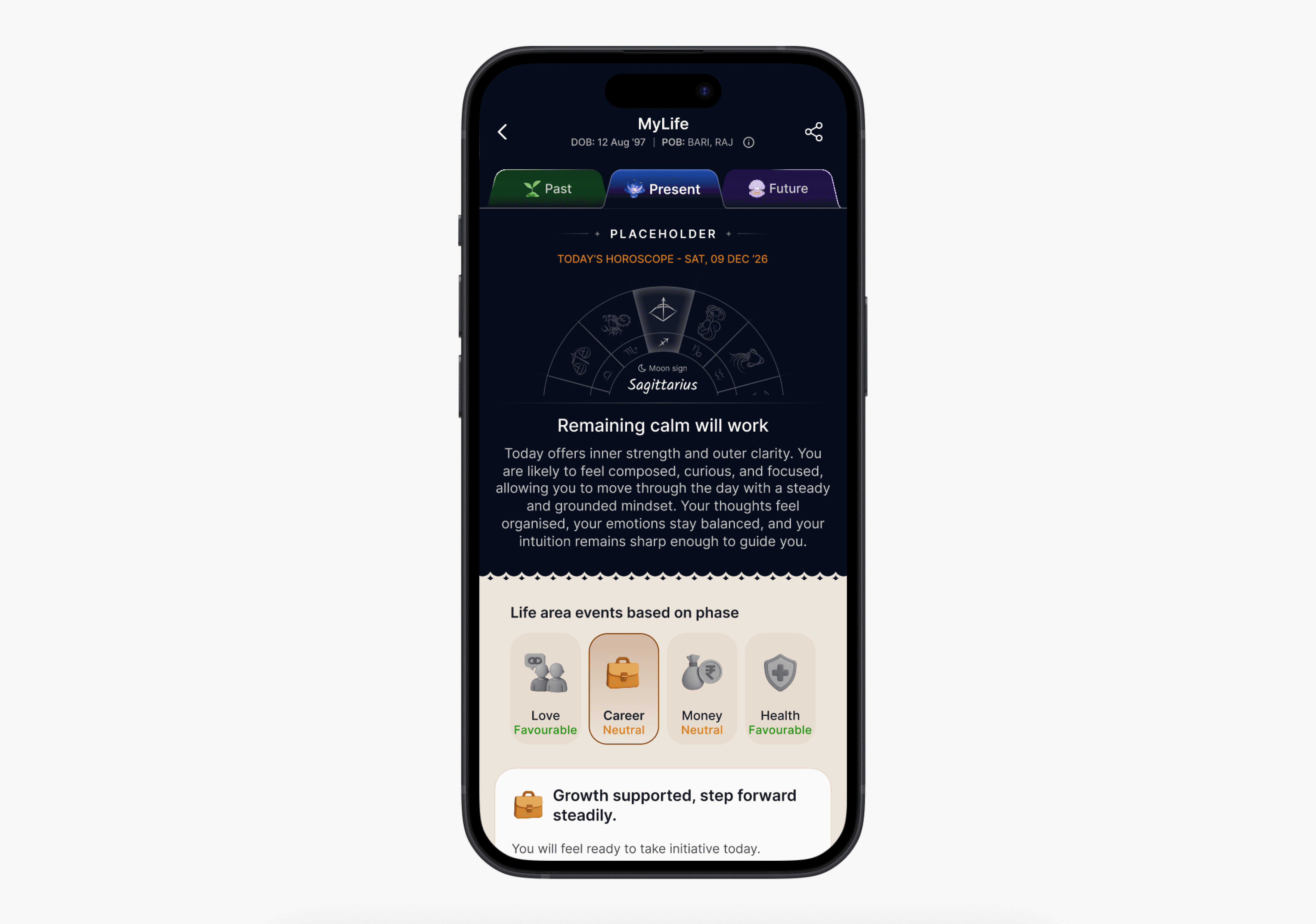
MyLife(Dasha)
The module we knew would drive long-term retention if we got it right. Originally architected as three sub-modules: Today, Past, and Future. We broke this apart during development and that breakup led to the product's most important design insight. See iterations.

Kundli
The birth chart is the most comprehensive piece of astrological information about a person. Housed the Kundli diagram, house details, Yoga and Dosha analysis, and strength and weakness cards. Technically the most complex module to generate via LLM.
Astrologer partner app: launched alongside, not after
The decision to launch the astrologer partner app alongside the consumer MVP was deliberate. The platform's revenue model depended on human sessions from day one. The consumer app alone generates engagement, but the astrologer app is where monetization lives. A consumer platform with no astrologers to connect to is an incomplete product.


Partner app MVP included: chat session management, user birth data pre-loaded at session start, quick reply templates in Hindi and English, session timer, and earnings tracking. Everything an astrologer already knew from other apps, nothing new needed to learn.
Iterations for Mylife
My Life was originally designed as three sub-modules in one: Today (daily insights), Past (historical Dasha events), and Future (upcoming Dasha predictions). Clean architecture on paper. We started building it as one unified module and immediately hit a problem, users arriving for the Future content felt no reason to trust the AI's predictions. The output felt like any other generic horoscope app.
We broke the module apart. Today's horoscope became its own entry-level section. My Life became the depth module focused on Past and Future. And in doing so, we discovered the insight that shaped the entire product's identity.
Testing two architectures
Variant A: Future-first display
Showed upcoming Dasha predictions directly. Users had no reference point to verify. They couldn't confirm if the AI was accurate. Low trust, low engagement.
Variant B: Past surprise approach
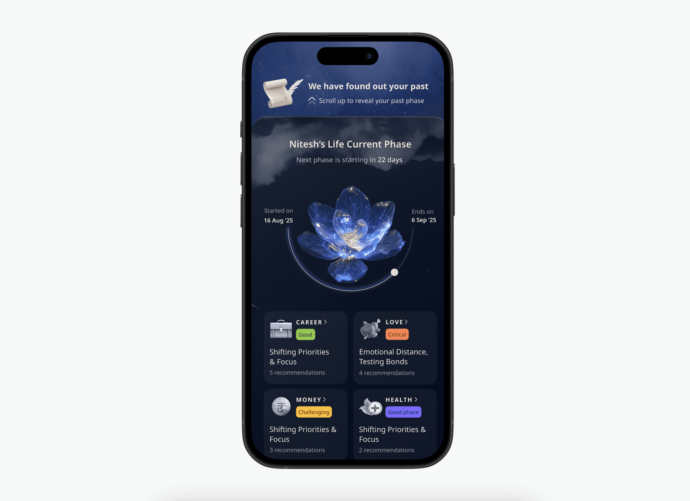
While the user is entering into future flow, We make the journey gamified by saying that we have found out your past. Show verifiable past life events before any future prediction. User confirms what already happened. Once the past is accurate, the future is trusted. This became the product's identity.
A: Future First Approach

Faster · WOW Factor · Higher trust
B: Past Suprise Approach
Learnings
We thought users were coming for their future. They needed to verify their past first. That reversal became MyNaksh's signature.
Solution

Contextual LLM loader: the wait as value delivery
Every competitor dropped users directly into a form. No orientation. No sense of how long. Our start screen showed the full journey as a checklist before the user tapped anything. Five steps with icons. The first step already showed "Already Filled" in a green chip to nudge user and subtly communicate that “we are fast”.

Kundli Module LLM Loader: Educates users during FTUX
Past-first trust architecture in the Dasha module
The My Life module opens with: "We've figured out your past. Would you like to see it?" Show verifiable past Dasha events — career shifts, emotional phases, relationship changes — mapped to the exact ages they occurred. The user can confirm these against their own memory. Once the AI is accurate about what already happened, the user trusts what it says about what's coming. This single design decision drove the 4.5 NPS on the module.

Live activity status: solving the per-minute trust problem
When an astrologer opens the Kundli utility during a session to check the user's chart, the user's chat window shows an animated status: "Astrologer is reading your kundli..." The silence becomes visible care. Users on per-minute billing see that the astrologer is actively working on their behalf. Support tickets about astrologers "not responding" dropped measurably in the weeks after this shipped. One design decision. Both sides of the platform benefited.

In-module experience converting to paid chat revenue
At the end of every DIY insight, a Dosha reading, a house analysis, a Dasha interpretation, a contextual chat widget appears with pre-written questions in Hindi. The user arriving at the end of a Kalsarpa Dosha reading already has a specific concern in their mind. The widget meets them there. "Paisa aata hai par tikta nahi?" does not ask the user to think of a question. It gives them one that already matches their state. This placement directly attributes to 9% of total daily platform revenue through astrologer conversion.

Loved solving this
Solving Inactivity during Chat/Call
Paid astrology consultations are charged per minute, which makes interruptions especially sensitive. If a user loses internet or closes the app mid conversation, they can easily assume they are still being charged for a lost session, while the astrologer faces the same uncertainty.
To avoid breaking trust, we designed a recovery flow that checked session state and inactivity duration before deciding the next experience. If the consultation was still active, users were taken directly back into the ongoing chat. If the session had genuinely expired, the app transitioned them to a clear end state instead.
This ensured continuity during temporary disruptions while keeping session rules transparent for both sides.

Astrologer App
AI Plugs for Astrologers while ensuring no training required
The astrologer's chat toolbar carries three AI-powered utilities available during any active session. Chat Summary: an AI-generated digest of the conversation so far, surfaced as a floating card in the thread, the astrologer can understand the user's concerns at a glance without re-reading the full history. Kundli utility: the user's full birth chart, Dasha table, Yoga and Dosha analysis, and current planetary period, all accessible without leaving the chat. User Profile: birth data, current city, marital status, and interaction history from the Shared Brain.


Astrologer App
Transparency for earnings & performance
We wanted make the navigation to earning and performance super clear, as it drives trust. The performance dashboard shows response rate, orders accepted vs missed vs rejected, and average session duration in plain language, not jargon. The earnings screen shows lifetime total, monthly breakdown, Already Paid vs Unpaid split, payment cycle dates with transaction IDs. Most platforms hide this data or present it confusingly. We treated astrologers as professionals running a business. Transparent earnings design was not an ops feature but more of retention strategy.

Shared Brain
The system that connects both sides of the platform
Every session a user has AI module or human astrologer generates signals about who this person is and what they care about. The Shared Brain captures these signals, builds a living user persona with checkpoints after each interaction, and uses it to personalise every subsequent experience across the entire product. Both sides of it.


The result: a platform that gets smarter with every interaction for AI modules and for human sessions equally. The astrologer opening MyNaksh knows more about a user before the session starts than an Astrotalk astrologer learns in a full paid conversation.
UI ShowCase
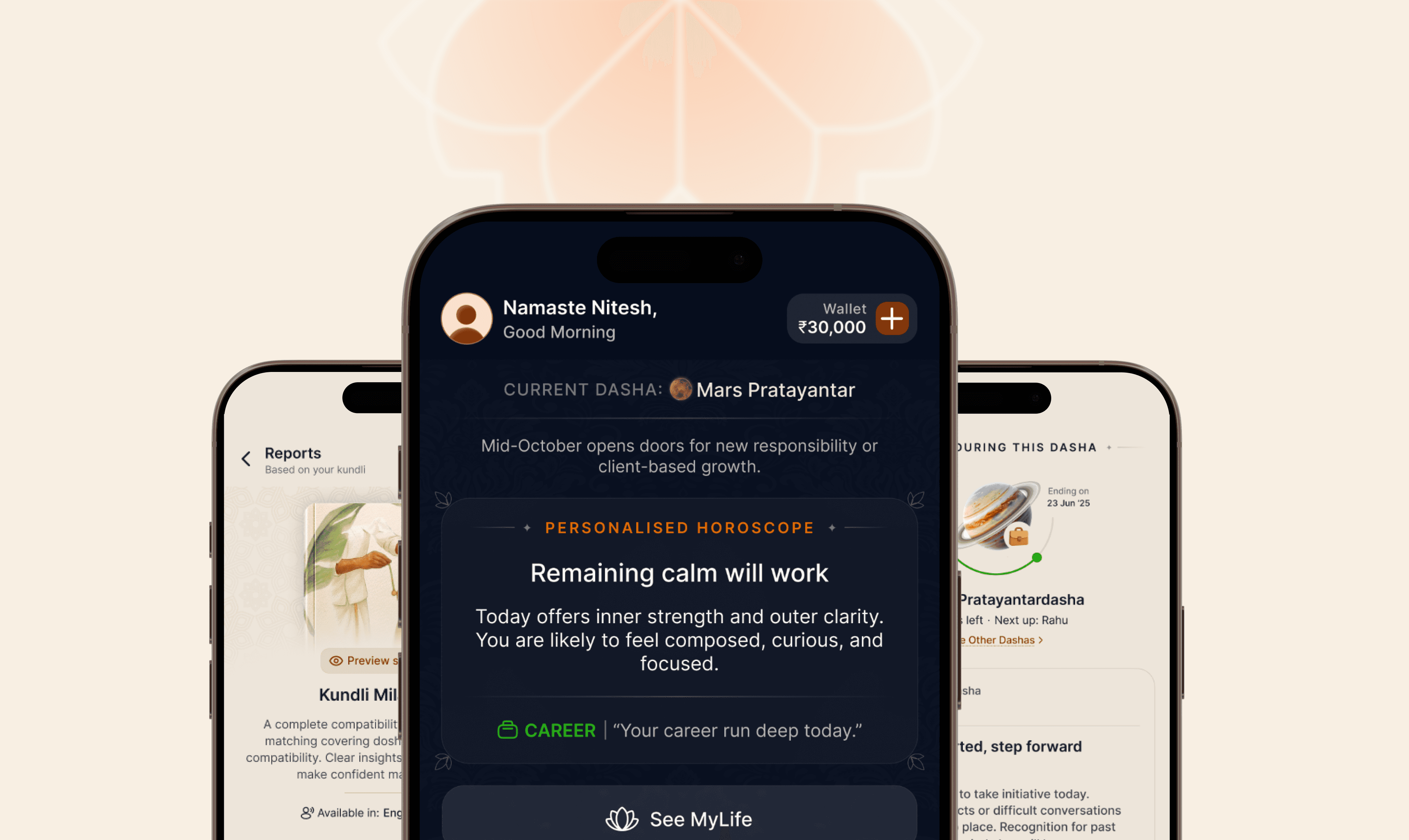
Consumer app in warm Vedic parchment. Past Life module in dark cinematic. The partner app in the same parchment base as the consumer side, one coherent platform, two completely different use contexts.
Summary
56%
M1 Retention in users who saw insight of Past Life Module
5%
FTX drop-off on LLM modules
98%
Scroll depth across modules
9%
Daily revenue from in-module chat widget placements
<5%
Astrologer requested for partner app training. Zero learning curve
32%
Faster stakeholder alignment via AI-tooled workflow
₹2 lakh+ per day in 8 months
Across multiple offering of consumer app, built from scratch.

